
Personal Brand
I'm Vinicius, but everyone calls me Vini. My personal brand is born from the fusion of vernacularity, technology, and experimentation, serving as a space to explore these concepts. The challenge was to create a visual identity that expresses this essence, highlighting materiality, acceptance of mistakes, and the human presence in design.
Essence & Experiments
Experimental • Typography
Visual Identity • Motion Manual Graphic Practices
Advisors
Prof. Marcelo Pliger
Collaborators
Vinícius Blauth Chaim


“DigitAl design is like Painting, except the paint nEver dries.”
Neville Brody


What's next?


Ensure it feels like it's made by humans for humans.
Stefan Sagmeister
That's how I opened my portfolio. It's how I open my personal brand. My personal brand is like me: stubborn, human, and plural. It moves between the digital and the manual, between the technical and the sensitive. It is born from the friction between tools and intuition, from the desire to experiment, to create with my hands, and to think holistically. A brand that refuses to be just one thing — because I’m not either.
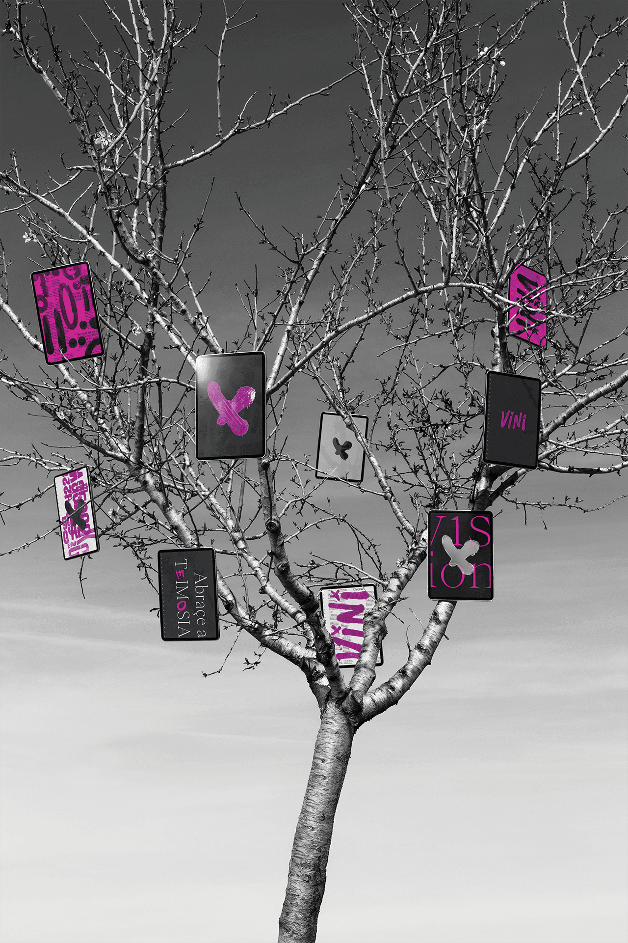
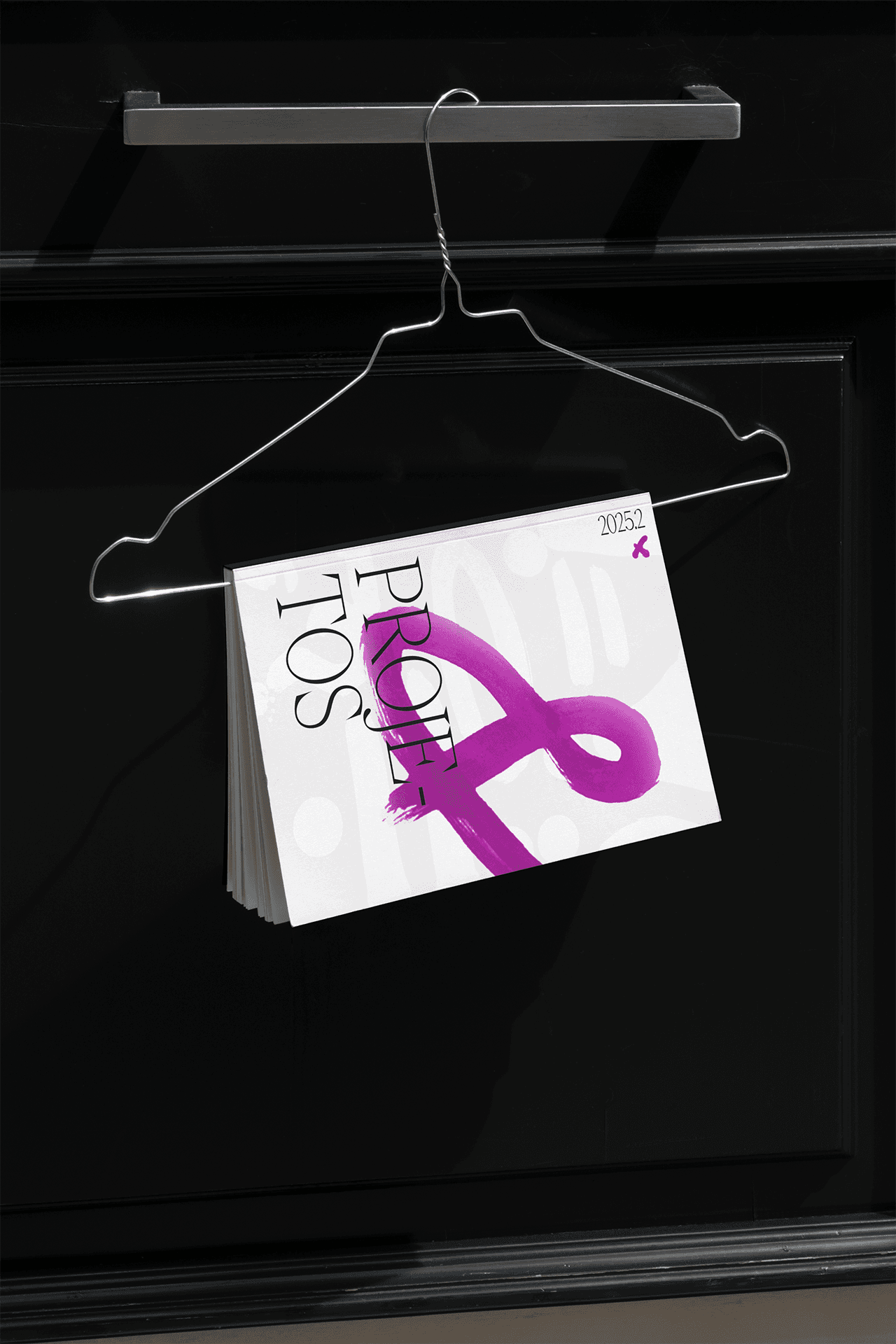
My brand embodies the words of Neville Brody: ink that hasn’t dried. The logo was created manually, on paper, and carries ink marks, stains, and textures that are evident — traces of the process that weren’t corrected, but rather incorporated. Instead of aiming for vector perfection from the start, the proposal was to capture the materiality of error, of trial, and of the hand.
The visual identity incorporates graphic interventions applied in an intuitive and free manner. These are textured and vector elements that overlap, dissolve, and recombine. These shapes are conceived as layers of experimentation, allowing each application of the brand to be a small reinvention.
The TEIMOSIA type family supports the identity with three stylistic sets. Like a strand of hair that refuses to lie down, it represents my stubbornness. I use it as a highlight, interspersed with a serif font — a digital typography with an analog soul.
In the applications, I sought to represent my plurality.
The logo was designed to work in different forms without losing its essence. It can appear worn, held by metal structures, thrown on a poster on the ground, or molded in glass. The strength of the brand lies precisely in its ability to adapt, while still maintaining coherence.
My brand translates experimentation and imperfection, creating a flexible system that balances materiality, digitality, and human expression.