
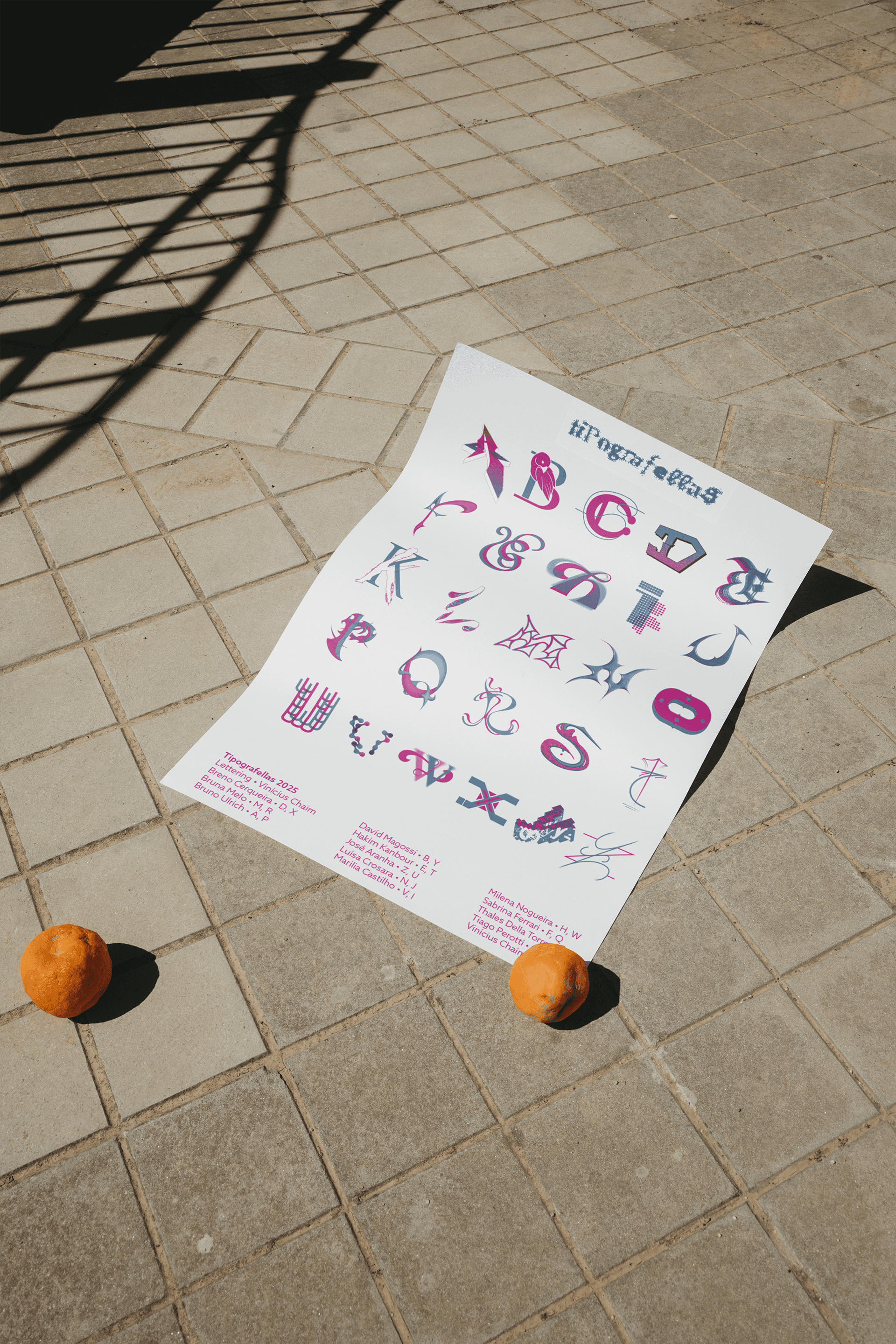
Tipografellas
Tipografellas is a typographic poster from A to Z that brings together 13 designers from ESPM, with each participant responsible for two letters. A celebration of the diversity of graphic design, the overlap and contrast between the letters are explored in a unique way. Inspired by initiatives like Brasiletras, we aim to explore a plurality of styles with a focus on artistic expression and creative freedom.
Letters & Layouts
Experimental • Typography
Collaborators
Vinicius Blauth Chaim • Breno Cerqueira Bruna Melo
Bruno Ulrich • David Magossi Hakim Kanbour
José Aranha • Luisa Crosara Marilia Castilho
Milena Nogueira • Sabrina Ferrari
Thales Della Torre • Tiago Perotti


I was responsible for the letters S and L, randomly assigned. The highlights of the typefaces are the vector stylizations that create depth, along with playful contrasts and counterforms.


What's next?


Each designer worked on the overlap of shapes and colors within their own letters, creating a dynamic interaction of transparencies and layers. The restricted palette of blue and pink was kept as a standard, but the final result varies greatly from one letter to another: some feature volumetric and three-dimensional forms, while others embrace more minimalist constructions, with gradients and graphic contrasts.
What makes Tipografellas special is precisely this stylistic freedom, which transforms each letter into a unique piece within a collective set.
Tipografellas unites typography and community in an identity that celebrates the interaction and multiplicity of design.