
Manual Graphic
Practices Collection
This project is a collection of graphic experiments that explore different printing techniques, composition, and visual development. The central idea is to investigate the materiality of design through manual and experimental processes, producing expressive results.
Letters & Layouts
Experimental • Typography
Manual Graphic Practices • Editorial
Advisor
Prof. Marcos Mello
Collaborator
Vinícius Blauth Chaim
Manuality as a
graphic language.


The explorations span across various categories, from stencils and stamps to bookbinding and letterpress.


Experimental and tactile visuality


We need to reclaim the materiality of graphic design, exploring handcrafted techniques and experimental processes to expand the expressive possibilities of the stories we create.

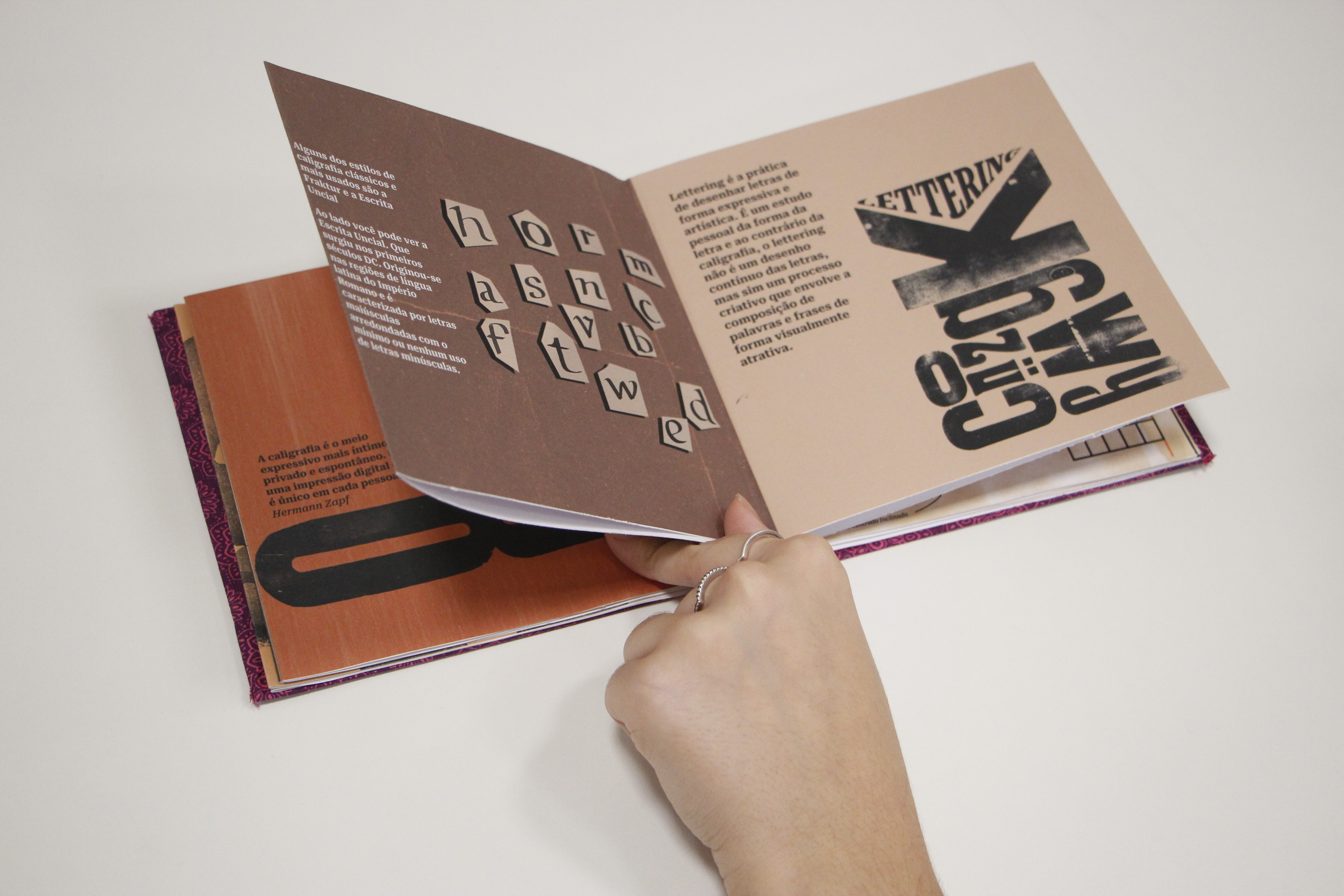
BOOKBINDING
Working with bookbinding was essential for exploring graphic materiality. The hardcover technique stood out due to its complexity, requiring precision in assembly, gluing, and finishing. Using kraft paper and calligraphic lettering, I created robust and sophisticated notebooks, blending durability with a handcrafted touch.
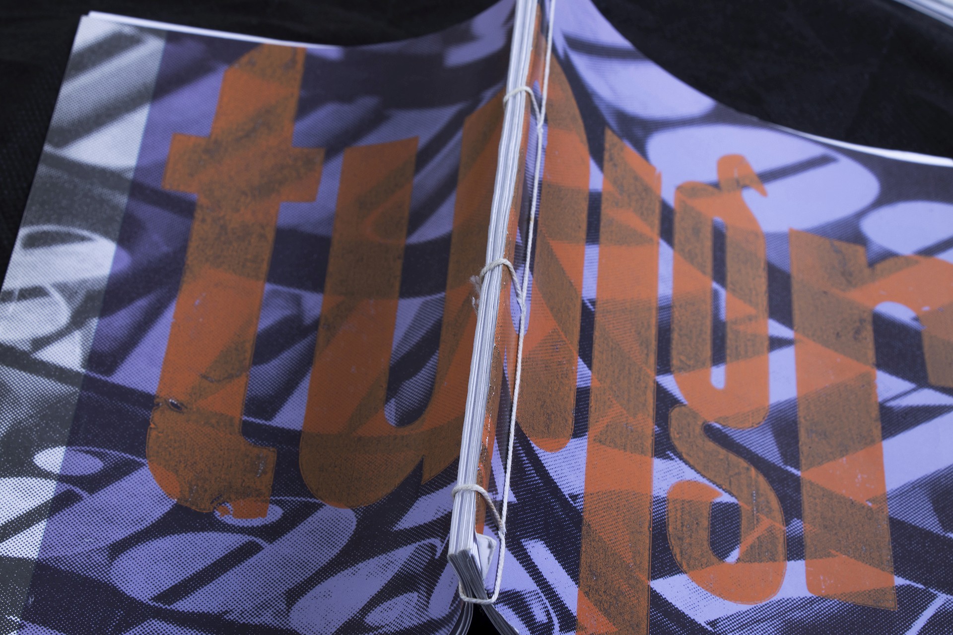
I also experimented with Japanese stitching, which highlights the visible stitches and adds a graphic aesthetic to the spine; the 8-stitch binding; and the French binding in an accordion format, used in the typographic booklet to create a tactile visual sequence.
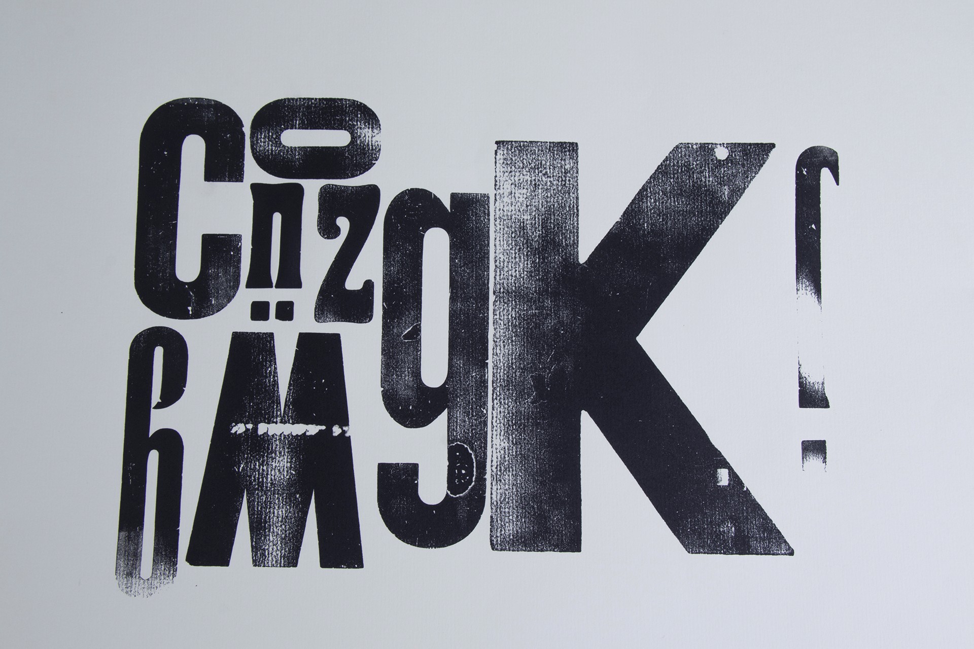
LETTERPRESS
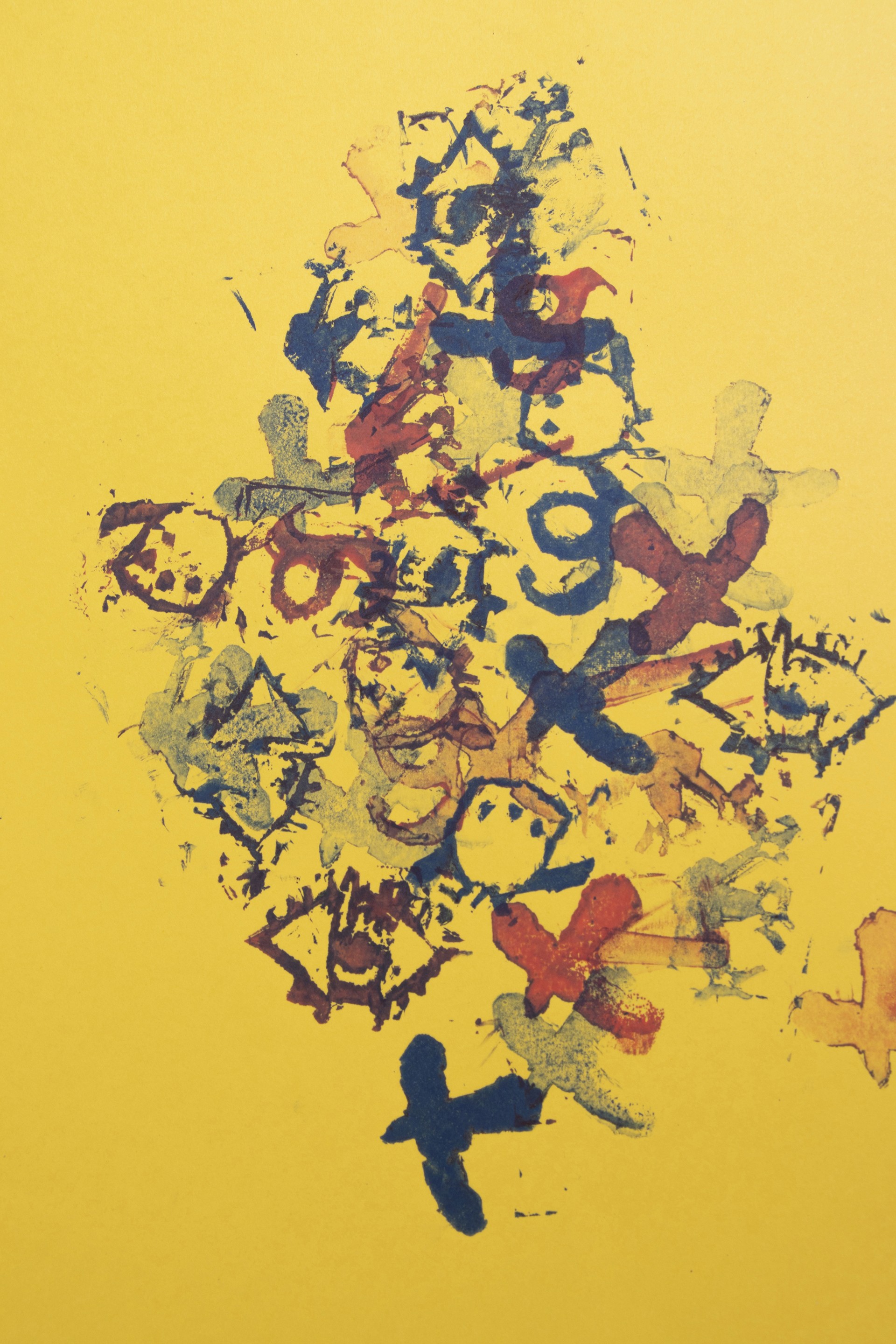
The letterpress production began through experiments carried out at the Typographic Workshop of São Paulo, where I worked directly with physical type and traditional printing processes. In this environment, I developed various graphic compositions, exploring ink overlays and textures.
Among the works created, the typographic booklet, previously mentioned, bound with French stitching in an accordion format, reinforces the handcrafted nature of the prints. In addition, I also produced posters and prints, using manual techniques to explore contrasts in form, color, and texture.
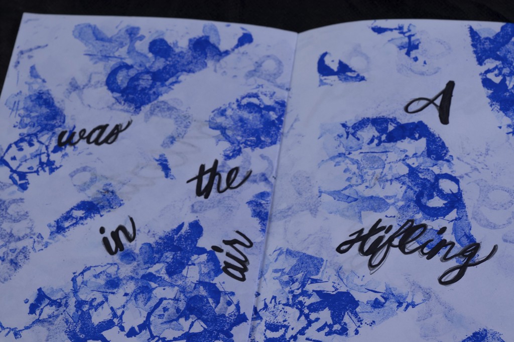
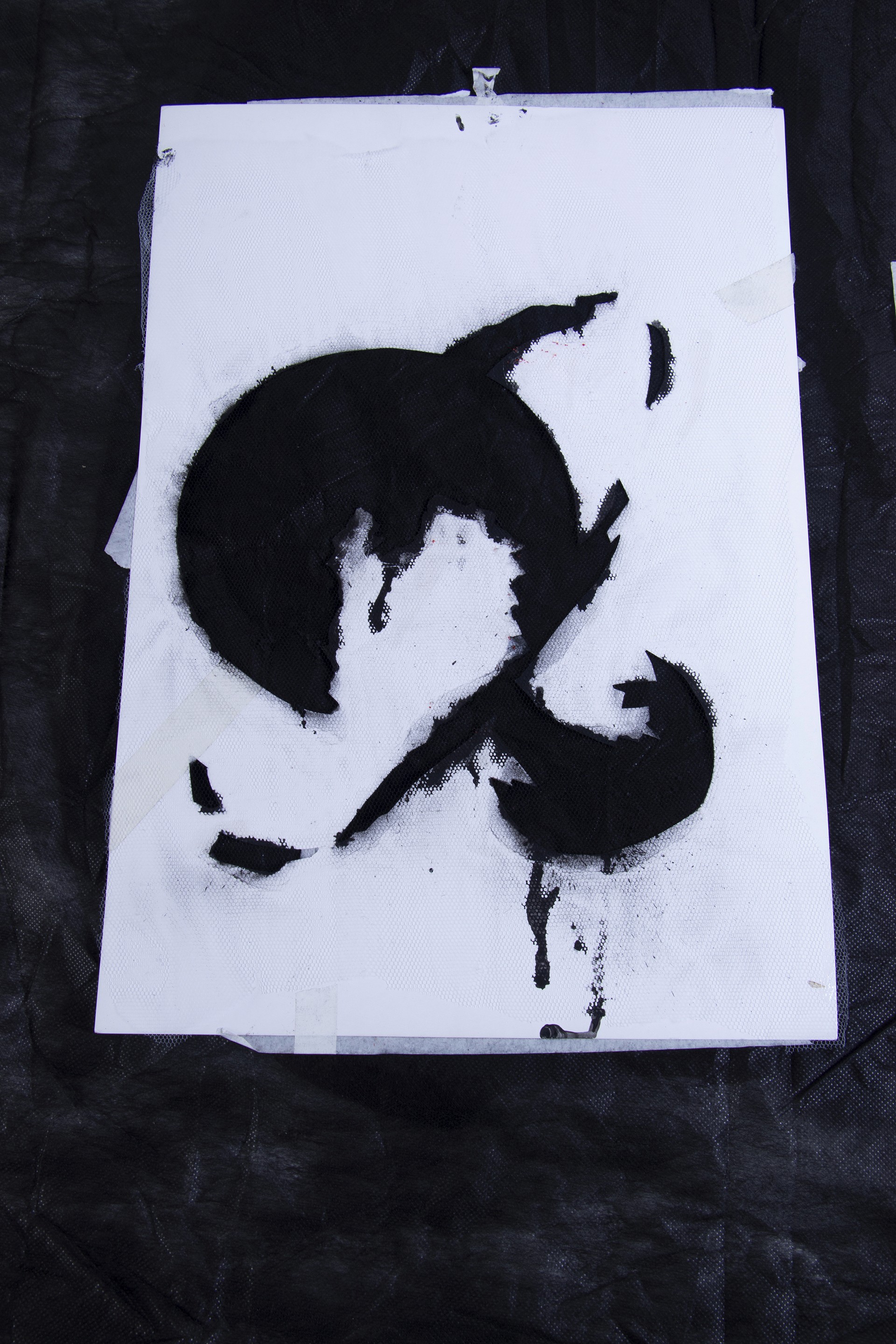
STENCIL & STAMPS
I developed a simple booklet, bound in an 8-stitch format, combining prints with blue stamps and a yellow cover, featuring a calligraphy from a passage of The Pit and The Pendulum by Edgar Allan Poe.
Within this manual approach, I also created a poster, working with free compositions and overlapping shapes, aiming to emphasize the expressiveness of the gesture and the print.
Finally, in collaboration with other design students, I created and applied stencils to a collective mural. The wall transformed into a colorful and dynamic field, designed to stimulate creativity through the repetition, variation, and interaction of the patterns.
What's next


